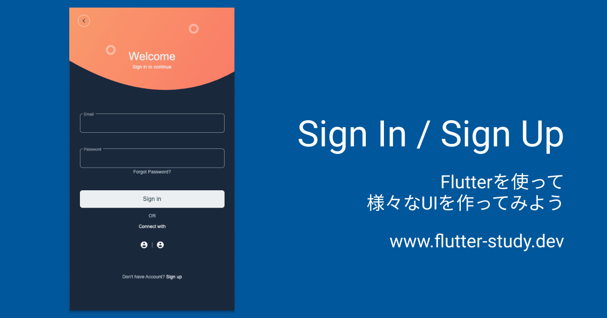
Sign In / Sign Up
今回作成するUI
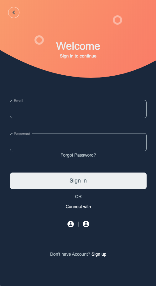
今回作成するUIは👇をベースに考えています。
完成イメージ
以下のようなログインページを作ってみましょう。
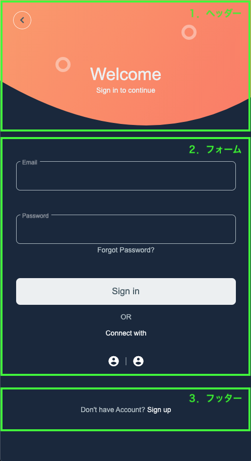
今回は大きく分けて3つの要素に分かれています。
- ヘッダー
- フォーム
- フッター
それでは、各要素ごとにUIを作ってみましょう。
|
|
共通部分
まずはじめに、ヘッダー・フォーム・フッターを表示する土台となる部分を
作ってしまいたいと思います。
import 'package:flutter/material.dart';
const Color kAccentColor = Color(0xFFFE7C64);
const Color kBackgroundColor = Color(0xFF19283D);
const Color kTextColorPrimary = Color(0xFFECEFF1);
const Color kTextColorSecondary = Color(0xFFB0BEC5);
const Color kButtonColorPrimary = Color(0xFFECEFF1);
const Color kButtonTextColorPrimary = Color(0xFF455A64);
const Color kIconColor = Color(0xFF455A64);
void main() {
runApp(MyApp());
}
class MyApp extends StatelessWidget {
Widget build(BuildContext context) {
return MaterialApp(
debugShowCheckedModeBanner: false,
title: 'Flutter Demo',
theme: ThemeData.dark().copyWith(
accentColor: kAccentColor,
),
home: WelcomePage(),
);
}
}
class WelcomePage extends StatelessWidget {
Widget build(BuildContext context) {
return Scaffold(
backgroundColor: kBackgroundColor,
body: SafeArea(
child: SingleChildScrollView(
child: Column(
children: [
/* ここに、ヘッダー・フォーム・フッターを並べていく */
],
),
),
),
);
}
}
ヘッダー
次にヘッダー部分を作っていきましょう。
UIを作成するための、大まかな方針としては以下の4つの要素に分割し、
それぞれを重ねていくイメージで行きたいと思います。
- 背景
- 丸を描く
- タイトル
- 戻るボタン

背景
背景は下の部分が丸みを帯びた形をしています。
この様な変形した枠のあるUIを作りたい時は ClipPath が使えますね。
オレンジ色の背景色を持った Container を ClipPath で下部分が丸みを帯びるようくり抜くのです。

https://www.youtube.com/watch?v=oAUebVIb-7s
class _HeaderCurveClipper extends CustomClipper<Path> {
Path getClip(Size size) {
return Path()
..lineTo(0, size.height * 0.5)
..quadraticBezierTo(
size.width * 0.55,
size.height,
size.width,
size.height * 0.6,
)
..lineTo(size.width, 0)
..close();
}
bool shouldReclip(CustomClipper<Path> oldClipper) {
return true;
}
}
class _HeaderBackground extends StatelessWidget {
final double height;
const _HeaderBackground({
Key? key,
required this.height,
}) : super(key: key);
Widget build(BuildContext context) {
return ClipPath(
clipper: _HeaderCurveClipper(),
child: Container(
width: double.infinity,
height: height,
decoration: BoxDecoration(
gradient: LinearGradient(
begin: FractionalOffset.topLeft,
end: FractionalOffset.bottomRight,
colors: [
Color(0xFFFD9766),
Color(0xFFFF7362),
],
stops: [0, 1],
),
),
),
);
}
}
丸を描く
丸を描く部分は、CustomPaint を使い2つの円を描きましょう。
細かい部分の描画であったり、複雑な描画が必要なものは CustomPaint を使うと便利ですね。
https://www.youtube.com/watch?v=kp14Y4uHpHs
class _HeaderCirclePainter extends CustomPainter {
void paint(Canvas canvas, Size size) {
final paint = Paint()
..color = Colors.white.withOpacity(0.4)
..style = PaintingStyle.stroke
..strokeWidth = 6;
canvas.drawCircle(
Offset(size.width * 0.25, size.height * 0.4),
12,
paint,
);
canvas.drawCircle(
Offset(size.width * 0.75, size.height * 0.2),
12,
paint,
);
}
bool shouldRepaint(CustomPainter oldDelegate) {
return false;
}
}
class _HeaderCircles extends StatelessWidget {
final double height;
const _HeaderCircles({
Key? key,
required this.height,
}) : super(key: key);
Widget build(BuildContext context) {
return CustomPaint(
painter: _HeaderCirclePainter(),
child: Container(
width: double.infinity,
height: height,
),
);
}
}
タイトル・戻るボタン
残りはタイトルと戻るボタンを作成し、Stack で各Widgetを重ねて表示しましょう。
この様に複数のWidgetを重ねて表現するようなUIでは Stack を使うと良いですね。
https://www.youtube.com/watch?v=liEGSeD3Zt8
class _HeaderTitle extends StatelessWidget {
Widget build(BuildContext context) {
return Column(
mainAxisSize: MainAxisSize.min,
children: [
Text(
'Welcome',
style: Theme.of(context).textTheme.headline4!.copyWith(
color: kTextColorPrimary,
fontWeight: FontWeight.w500,
),
),
SizedBox(height: 4),
Text(
'Sign in to continue',
style: Theme.of(context)
.textTheme
.subtitle2!
.copyWith(color: kTextColorPrimary),
),
],
);
}
}
class _HeaderBackButton extends StatelessWidget {
Widget build(BuildContext context) {
return TextButton(
style: TextButton.styleFrom(
primary: kButtonTextColorPrimary,
backgroundColor: Colors.transparent,
shape: CircleBorder(
side: BorderSide(color: kButtonColorPrimary),
),
),
onPressed: () {},
child: Icon(Icons.chevron_left, color: kIconColor),
);
}
}
class _Header extends StatelessWidget {
Widget build(BuildContext context) {
final double height = 320;
return Container(
height: height,
child: Stack(
children: [
Align(
alignment: Alignment.topCenter,
child: _HeaderBackground(height: height),
),
Align(
alignment: Alignment.topCenter,
child: _HeaderCircles(height: height),
),
Align(
alignment: Alignment.topCenter,
child: Padding(
padding: EdgeInsets.only(top: 128),
child: _HeaderTitle(),
),
),
Positioned(
top: 16,
left: 0,
child: _HeaderBackButton(),
),
],
),
);
}
}
フォーム
次は、フォーム部分を作っていきましょう。
ここは、特に難しいことはなく、Column を使い各要素を上から下に並べていけばOKですね。
class _CustomTextField extends StatelessWidget {
final String labelText;
final String hintText;
final bool obscureText;
const _CustomTextField({
Key? key,
required this.labelText,
required this.hintText,
required this.obscureText,
}) : super(key: key);
Widget build(BuildContext context) {
return TextField(
decoration: InputDecoration(
labelText: labelText,
hintText: hintText,
hintStyle: TextStyle(color: kTextColorSecondary),
floatingLabelBehavior: FloatingLabelBehavior.always,
focusedBorder: OutlineInputBorder(
borderRadius: BorderRadius.circular(8),
borderSide: BorderSide(
color: kAccentColor,
),
),
enabledBorder: OutlineInputBorder(
borderRadius: BorderRadius.circular(8),
borderSide: BorderSide(
color: kTextColorSecondary,
),
),
),
obscureText: obscureText,
onTap: () {},
);
}
}
class _SignInForm extends StatelessWidget {
Widget build(BuildContext context) {
return Column(
children: [
_CustomTextField(
labelText: 'Email',
hintText: 'your email address goes here',
obscureText: false,
),
SizedBox(height: 48),
_CustomTextField(
labelText: 'Password',
hintText: 'your password goes here',
obscureText: true,
),
SizedBox(height: 4),
Text(
'Forgot Password?',
style: Theme.of(context)
.textTheme
.bodyText2!
.copyWith(color: kTextColorSecondary),
),
SizedBox(height: 48),
Container(
width: double.infinity,
child: TextButton(
style: TextButton.styleFrom(
primary: kButtonTextColorPrimary,
backgroundColor: kButtonColorPrimary,
padding: EdgeInsets.symmetric(vertical: 16),
shape: RoundedRectangleBorder(
borderRadius: BorderRadius.circular(8),
),
),
onPressed: () {},
child: Text(
'Sign in',
style: Theme.of(context)
.textTheme
.button!
.copyWith(color: kButtonTextColorPrimary, fontSize: 18),
),
),
),
SizedBox(height: 16),
Text(
'OR',
style: Theme.of(context)
.textTheme
.bodyText2!
.copyWith(color: kTextColorSecondary),
),
SizedBox(height: 16),
Text(
'Connect with',
style: Theme.of(context)
.textTheme
.bodyText2
.copyWith(color: kTextColorPrimary),
),
SizedBox(height: 24),
Row(
mainAxisAlignment: MainAxisAlignment.center,
children: [
IconButton(
icon: Icon(Icons.account_circle),
onPressed: () {},
),
Container(
color: kTextColorSecondary,
width: 1,
height: 16,
),
IconButton(
icon: Icon(Icons.account_circle),
onPressed: () {},
),
],
)
],
);
}
}
フッター
次は、フッター部分を作っていきましょう。
テキストを表示すればOKですね、さくっと作ってしまいましょう。
class _Footer extends StatelessWidget {
Widget build(BuildContext context) {
return Row(
mainAxisAlignment: MainAxisAlignment.center,
children: [
Text(
'Don\'t have Account?',
style: Theme.of(context)
.textTheme
.bodyText2!
.copyWith(color: kTextColorSecondary),
),
SizedBox(width: 4),
Text(
'Sign up',
style: Theme.of(context)
.textTheme
.bodyText2!
.copyWith(color: kTextColorPrimary),
),
],
);
}
}
作成したWidgetを表示
最後に、作成したヘッダー・フォーム・フッターのWidgetを表示しましょう。
最初に作成した、土台部分に組み込めばOKです。
class WelcomePage extends StatelessWidget {
Widget build(BuildContext context) {
return Scaffold(
backgroundColor: kBackgroundColor,
body: SafeArea(
child: SingleChildScrollView(
child: Column(
children: [
_Header(),
Padding(
padding: const EdgeInsets.symmetric(horizontal: 32),
child: _SignInForm(),
),
Padding(
padding: const EdgeInsets.symmetric(vertical: 64),
child: _Footer(),
),
],
),
),
),
);
}
}
お疲れさまでした
UIは無事作成できたでしょうか?
この他にも様々なUIを作ってみて、Flutterで複雑なUIが表現できるように頑張りましょう 💪

